Background
MyGeotab allows fleet managers, to assess the performance and health of their fleets through a chart based reporting dashboard. In 2019 our analytics were showing low engagement with this section in the application. Interviews with customers and our support teams uncovered the following key opportunities:
- The existing charts only presented as static images. This created redundant functionality that was circumvented by a user flow where users either relied on reoccurring rules based notification emails that flagged any issues that came up, or would go straight to specific report pages that listed out any problem entities (e.g. view list of vehicles with battery issues).
- Turning raw data into bespoke charts in MyGeotab was too complex for our small to medium size businesses. The process involved exporting a schema template in the form of an excel file, manipulating that template data, generating charts in excel, and then re-uploading the file. This meant only our users who had partnerships with Geotab resellers, that have the specialized technical teams, were able to produce dashboards tailored to their needs.
- The system only allowed each database to have a single dashboard making it difficult for teams within large organizations (with multiple types of teams) to create dashboards targeted to their own needs. Much of the time, dashboards ended up being both too generic for technical teams and too specific for higher level managers.
Solution Framing
I guided a process with the senior product manager (PM) on MyGeotab and engineering leadership to identify all current chart and dashboard based initiatives that were in-flight across product teams. The purpose of this was to map out of all the capabilities we had to work with and identify any overlaps in efforts. From there I facilitated a prioritization of these efforts with the VP of Software Development, the engineering teams, and the PM. I used an opportunity matrix as the framework for this process, a tool adapted from the Outcome-Driven Innovation methodology .
Example of prioritization efforts (below); aiming to focus our efforts based on impact to user outcomes, the user's satisfaction with the existing processes they have to pursue those outcomes, and the technical features that would be foundational for other high value features:

In parallel with the prioritization exercise I also pulled in research findings on archetypes and user journeys I had previously uncovered when conducting research for a different project on predictive maintenance. I worked closely with the PM to validate the relevancy of the research and fill in any outstanding knowledge gaps.
Key archetypes we ended up focusing on were:
1. Fleet Managers
• Provides direction on fleet policies, operations, asset management, and budget
2. Compliance Managers
• Ensures the safety of assets and staff based on both corporate and government regulations
3. Maintenance Teams
• Maintains day to day asset uptime, safety and operational efficiency
Overall our experience would focus on a few core areas of the user's work journey:
1. Daily morning review
• Reviewing key metrics related to overall fleet health
2. Following up on issues
• As reported by stakeholders, rules based email notifications, and recurring reports

Before diving into mockups I wanted to better understand the underlaying data structures that existed, the operations our users would likely expect, and any new types of data or meta-data our users would likely need to to complete their tasks. To gain this foundational understanding I mapped out the conceptual data objects and operations from all the sources I had gathered up until this point. I then threaded the data objects, operations, and identified use cases into a conceptual model of the solution and reviewed with engineering & product management.
Example of concept modelling process:

From there I designed an initial UI concept to envision how everything could fit together into a unified experience for our end-users. This additional perspective on how the hierarchy and relationships between data would fit together to deliver value to our end-users helped the PM, development teams, and myself further refine the product requirements and users stories.
Key Solutions
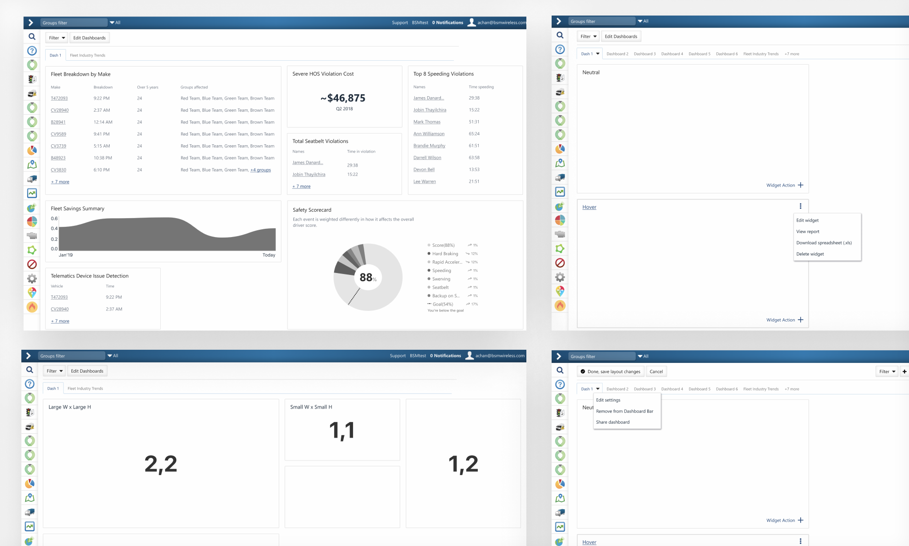
Created a chart builder tool to simplify the process of turning raw data within MyGeotab into interactive charts. Users can now aggregate data in a variety of ways, manipulate how it is formatted, and preview charts live before publishing them on on their dashboard. Now it just takes a few guided steps for different types of users with varying needs to get charts tailored to the jobs they need to get done.

Previously charts on the dashboard were static. This ended up meaning it was more efficient for users to just bypass the dashboard, and instead go directly to different report pages one at a time where they could navigate through the details of a potential issue. Now on the dashboard, users can click on the different bucketed categories on charts to drill down into the details of the data, navigating directly into reports and filtering them based on the anomalies identified in the charts (e.g. view list of vehicles with high risk battery issues). We added value back to the dashboard by carving it into a system of navigation, making it more intuitive for users to identify and investigate anomalies.

Opportunities that were identified as high priority for the next version were turned into design concepts, and loosely accounted for in this version of the designs to reduce potential design and technical debt. A peak into the potential future state of the experience also helped uncover more known unknowns for our product roadmap.
Envisioned a design concept where customers could have multiple dashboards on a single database, paired with the ability set user permissions for each dashboard. This would allow the diverse teams and users within organizations to have dashboards tailored to the their workflows, at as technical or high-level as their role demanded.

Next Steps
New features were prototyped and tested with key customers (as proxies for end users) through regular checkpoint meetings. We used these meetings to pivot quickly on usability and value areas, and additionally to inform our product roadmap. Our first release was limited to users who were opted-in to our beta program called "feature preview. We did this to work out any at scale development bugs and usability kinks before a full release.
- Conduct deeper usability and value testing with users. Especially targeting small to medium businesses that would benefit the most from the self serve features.
- Review analytics, findings from beta release feedback, and user testing. Update any identified critical issues before full release. Adjust roadmap with PM and development team for non-critical issues and new ideas.
- Work with PM and other key stakeholders to define key success metrics. Specifically laying out a benchmark and tracking plan for Happiness and Task Success from Google's HEART metrics, using NPS (Net Promoter) and SUS (System Usability) scores respectively; paired with usability and solution validation testing.
